Color isn’t just paint— it sets guest expectations before they ever sit down. The right palette can telegraph “quiet luxury,” increase perceived cleanliness, and even nudge guests toward better reviews. Below is a practical framework, plus an interactive tool to design a palette on the spot.
First impression velocity: Guests form a visual judgment in seconds. Neutrals with controlled contrast read premium and clean; a single saturated accent adds memory without chaos.
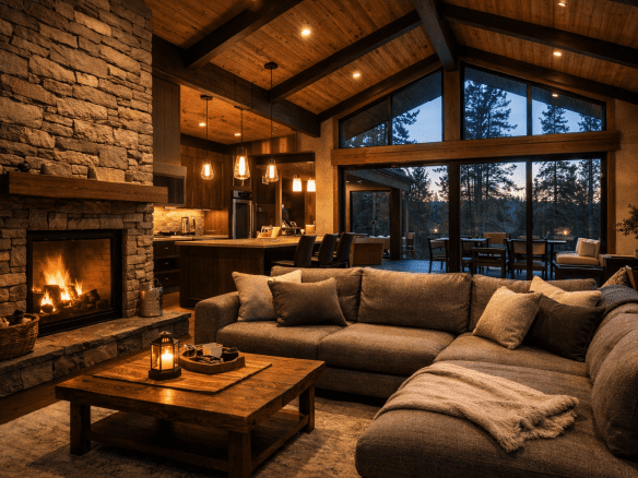
Emotional priming: Cool, low-saturation hues calm and enlarge; warm mid-tones feel inviting and intimate. High chroma = energetic; low chroma = refined.
Consistency = perceived quality: When walls, textiles, and metals harmonize, the space feels intentionally designed (not busy). Build a palette first—select finishes second.
Core Palette Structure for “Quiet Luxury”
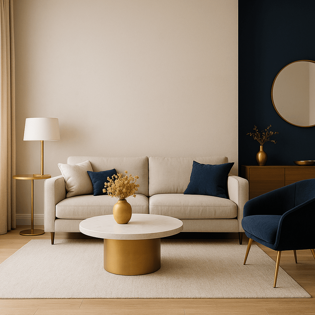
- Foundation (Walls 60%) — low-saturation, light to mid value (e.g., warm greige, soft ivory, muted stone).
- Secondary (Textiles 30%) — one step darker/lighter than walls for depth.
- Accent (10%) — a single hue with higher chroma (art, pillows, a powder room).
- Metal Tone — the jewelry: brushed brass for warmth, matte black for modernity, soft nickel for cool minimal.
Color Strategy Simulator
Dial in mood, adjust HSL sliders, and preview a room instantly.
How to Use the Palette
- Paint walls your Foundation color first; match trim either one step lighter or in crisp white.
- Choose textiles in the Secondary tone to add depth without visual noise.
- Reserve the Accent for one focal moment per room.
- Lock in one Metal finish per space to avoid clash.
Looking for performance-first planning? Try the Lunigo Revenue Calculator.
We can pressure-test it against your market and listing photography.